
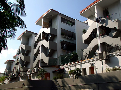
Pre-war SIT flats
I went back to have a walk around this estate and to my horror, paint jobs were given to the predominant orange stairs (see previous post) that stood as icons to the estate! Somehow, it makes reading of the flats a lil more different, more subdued. I wonder what was the decision behind this. Well apparently these were the original colours of the colonial scheme.

5 comments:
Now it look like Prison colours.
There's a slight problem whenever a new coat of paint comes along to any estate. Our eyes are never used to it and we start to complain. But soon enough, we'll all get used to it, awaiting for another new coat. Hmm...thus I guess I would not say its horrible, nor would I say its nice...just a new coat of paint lor...
YS, I agree with you.
The orange theme was not well received back then as it made the place look so much like Chinese Garden.
But we all got used to it eventually.
I'm actually still quite undecided on the grey.
On a bright sunny day, it look beautiful....but on a cloudy day, it just makes the place look very dull.
But you are right, we will eventually get used to it.
(I just think the grey at the back part of the building is a tad too GREY while the front part of it is balanced and nice....maybe that's why I'm undecided)
Sgalf: agreed, its too prison, on instincts, i just can't help myself but say "erghhh". but colours and aesthetics are a highly subjective matter and won;t please everyone.
"getting used to" is probably another subjective thing.
Well i guess we'll have to give it a month or two and see if it grows on us or
makes us want the old orange back again
The white and grey are perfect colors in my opinion- let everything else- the clothes, the plants, be the stars of the show. Let everything else be background.
It's perfect now.
Post a Comment